Design
System
Ds
Ema’s brand system reflects clarity, intelligence, and trust. Our guidelines ensure every expression, visual or verbal, feels consistent, mature, and approachable.
From logo to layout, each element works together to create a seamless identity that communicates both sophistication and human connection.
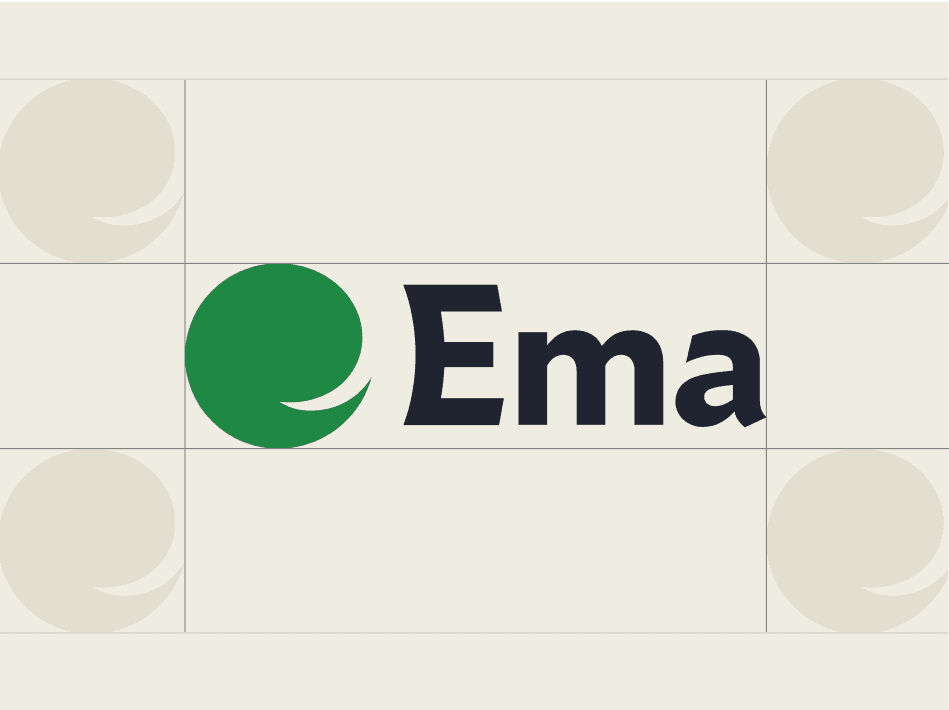
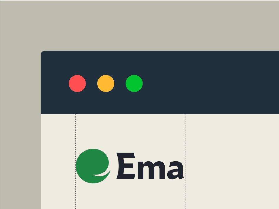
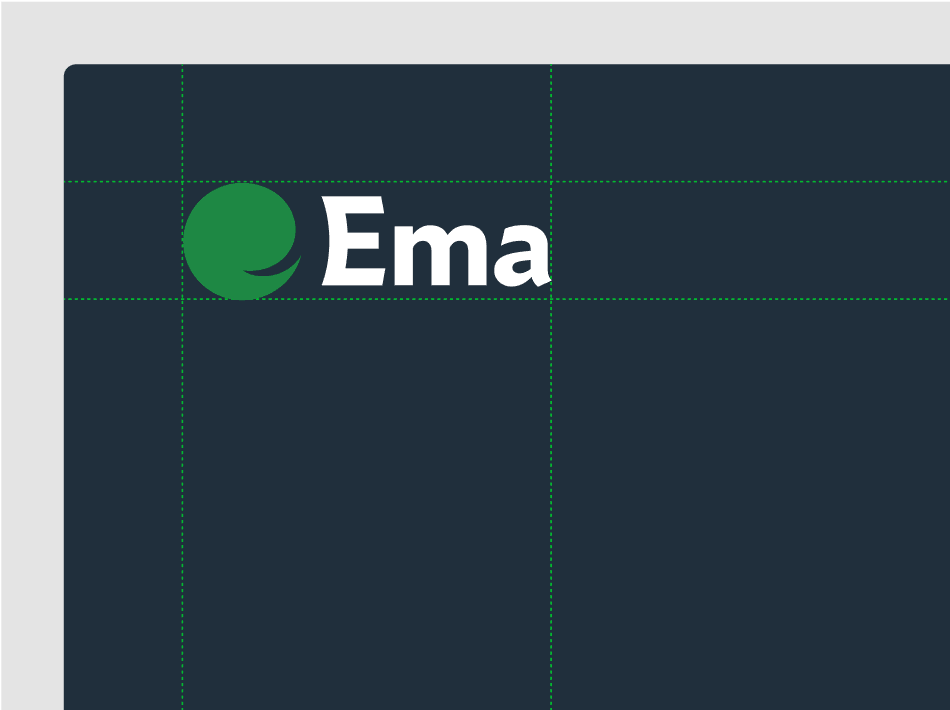
Logo
L
The Ema logo is the cornerstone of our identity. The inwards swooping negative space represents the “e” in Ema, as well as a chat bubble. It is crafted to feel optimistic, feminine and friendly.
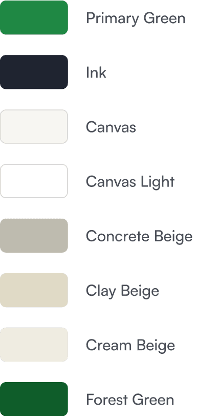
Colour
C
Ema’s colour palette is designed to balance professionalism with warmth. The core green embodies growth, connection, and progress, while the supporting neutrals provide a refined and elegant backdrop.
Typography
T
Light
Medium
Semibold
Bold
Extra Bold
Variable
Italics
Glyphs
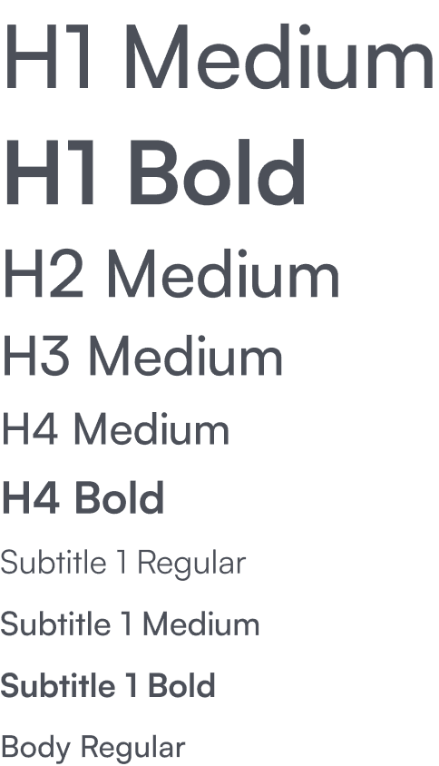
Typography is central to Ema’s voice. We use Satoshi for all communication, chosen for its clarity and modern simplicity that makes content approachable.
TYPEFACE
Imagery
Im
Imagery at Ema captures its human and professional side. Chosen to feel authentic, warm, and sophisticated, they highlight collaboration, modern workspaces, and moments of focus.
Illustration
IL
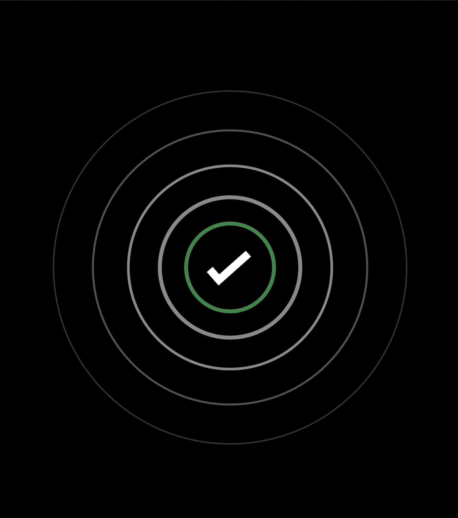
Ema’s illustrations use clean, minimal, and purposeful 2D and 3D representations of Ema's features, shifting between flat and isometric that feels easy to understand and approachable to a new user.


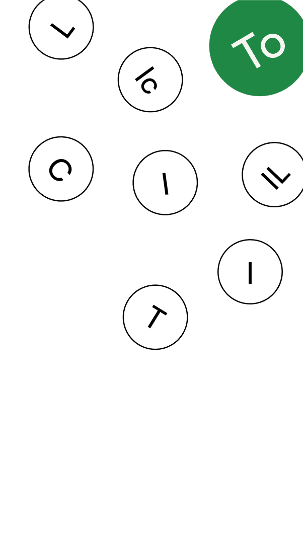
Iconography
Icons in Ema’s system are designed for clarity and function. Simple geomety ensure recognition at any scale while maintaining consistency with our typeface and illustration style.


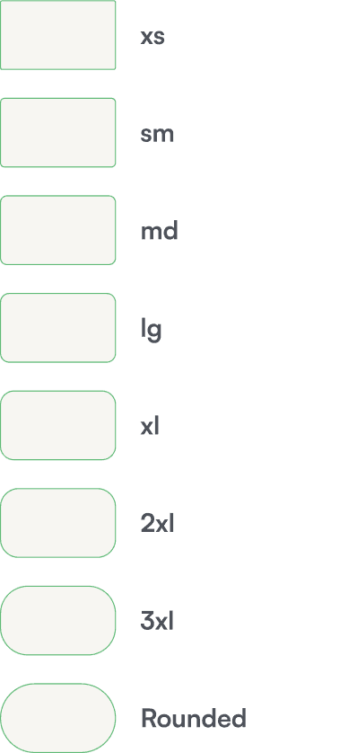
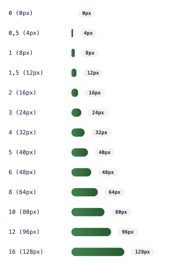
Token System
The Ema design token system ensures scalability and consistency across platforms. Tokens are the building blocks of our digital experience. By standardizing these values, we ensure that every product touchpoint feels cohesive, efficient, and true to the Ema brand.
COLORS
SPACING
TYPOGRAPHY
RADIUS