Logo
L
Icon Meaning
The primary colors set a calm, professional tone and ensure
brand consistency. The secondary palette adds flexibility,
offering complementary tones for diverse layouts that still feel
cohesive.
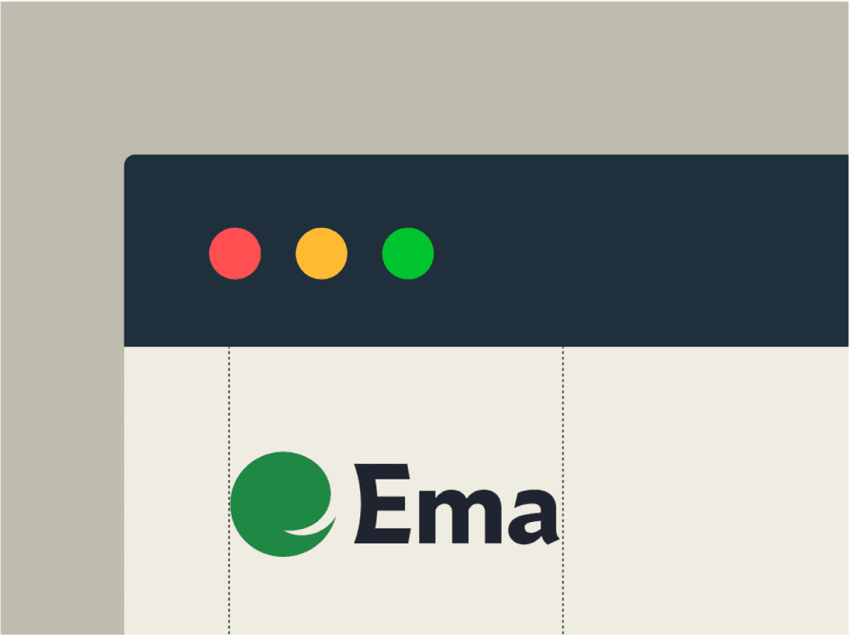
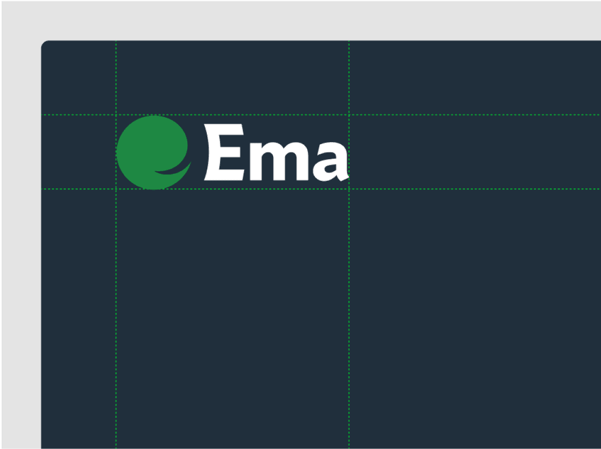
Logo Usage
White is the dominant color, ensuring a clean and minimal aesthetic. Sky blue (25%)serves as the primary background, while deep sea blue (15%) is used for text and accents to reinforce readability. Yellow (12.5%) and Green (12.5%) function as background highlights, with Rustwood brown and Forest green applied to text forcontrast and


COLOURS
Logo Construction
The icon is constructed from 3 Ovals that represent Enterprise Machine Assistant

Neural Network


Overall Aesthetics
The rule for applying colors in typography is simple, as previously mentioned. Avoid these mistakes at all costs when choosing type colors:

Animated Logo
The rule for applying colors in typography is simple, as previously mentioned. Avoid these mistakes at all costs when choosing type colors: